Increased completion rate by 28%
RBC Online Banking
Role: Product Designer
Duration: 3 months
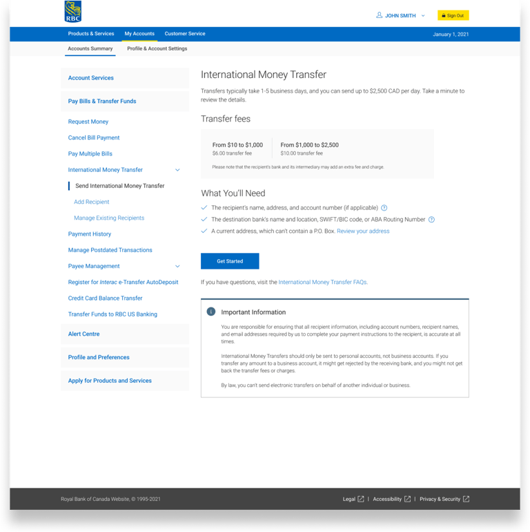
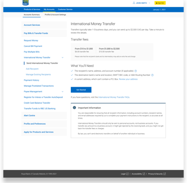
You need to send money to your family abroad for a medical emergency.
You log in to your RBC account, but you get stuck. You're unclear how much it would cost you. You're unsure what account information you'll need from your family. How do you even begin to explain to your family what a SWIFT code is?!
Imagine this...
You have to spend time trying to find the fee. You try to learn about all these banking terminologies for the first time.
You try to start the process but decide to drop because you're not confident enough with this experience. You just feel confused, overwhelmed, and think "There's probably easier alternatives out there."
What would you do?
"It is not transparent as to what the fees are or who charged them. It’s a guessing game and I sometimes don’t know where to find them.”
— Client Feedback from Advice Centre, 2020
Data tell us that many clients drop off without completing the transfer
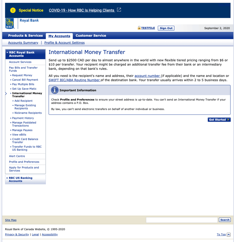
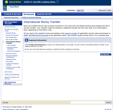
That's what happened to the 90% of clients who started IMT but never completed it. We saw an 85% session drop-off just on the landing page alone.
Our IMT service is difficult and confusing to use. Compared to alternatives such as PayPal or Western Union, it doesn't meet our clients' needs for an easy and quick money transfer service.
Adding a new recipient is the biggest pain point
Not knowing what’s required leads to some senders doing a “trial run” just to gather the information needed to complete their transfer. Look at the screenshot - that's A LOT of information they have to ask for.
First-time experience is nerve-racking
Senders were nervous and intimated by the experience the first time they sent an international money transfer, largely due to fear of mistakes, unfamiliar language, bank terminology, and missing information (i.e. recipient details)
Sender has to monitor transfer status with their recipient
The feeling of money going in limbo causes a lot of anxiety. Senders are left to continuously check in with their recipients to ensure they’ve received the money.
But, research tells us the full story
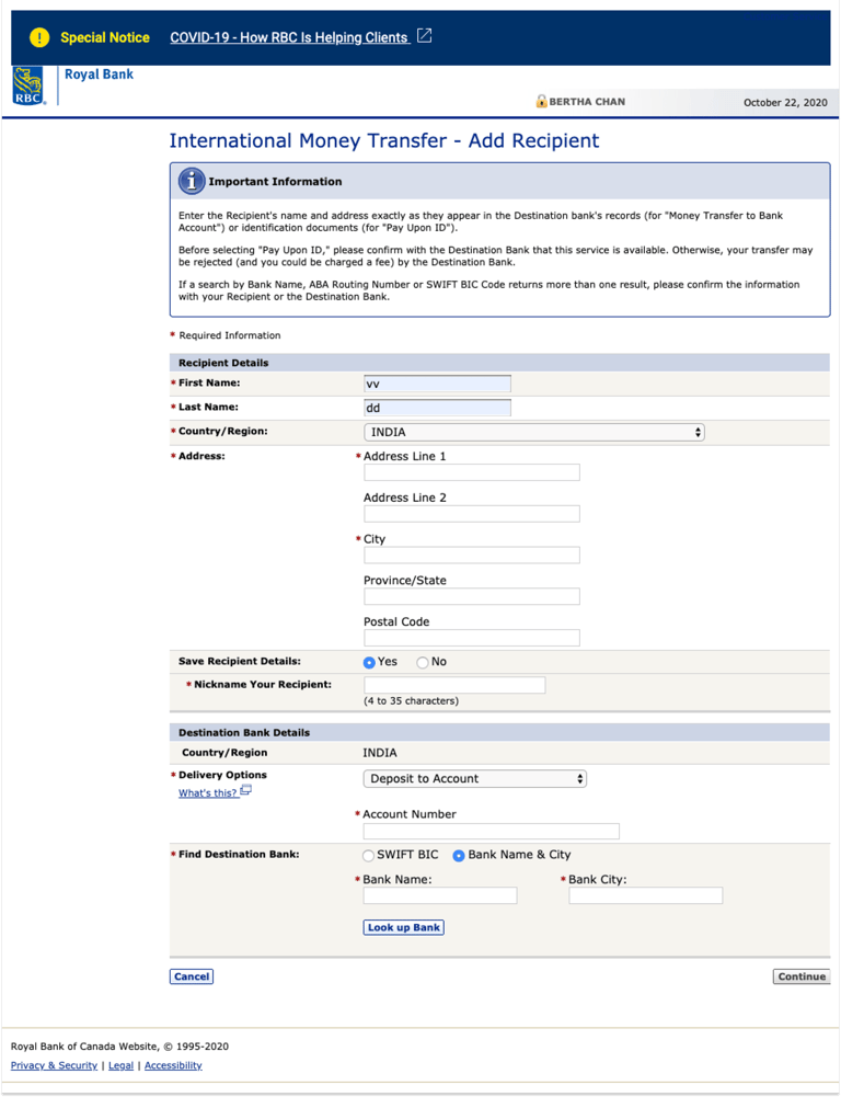
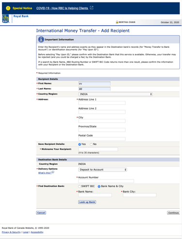
“I’ll go through a fake money transfer process without sending the money and be like, ‘Oh, this is the information that I need, can you (the recipient) send that over?’”
— Client Research, 2020
Prioritize design efforts in high-impact areas
We believed that designing with first-time users in mind would solve the pain points of other users. My tech and product partners and I agree that our main objective is to reduce drop-off rates. With a clear problem and objectives in mind, I focused my work on these design goals:
Improve transparency
Provide a clear fee structure and set expectations upfront
Simplify terms
Eliminate bank lingo and provide guidance where it matters
Guide the user
Help users understand the recipient’s banking details
Thought I was doing well, but the design failed in usability testing with 100% Fail Rate 😱
No one was able to figure out where to search or knew that they had to add the bank details. This is an important step of the process, as it asks the sender for the recipient's bank information. The participants completely missed it and skipped the step.
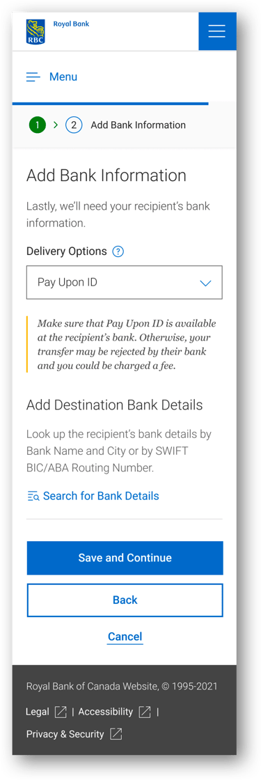

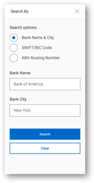

“I thought this is either (select from dropdown) or (add details) so I didn't think to Search”
— All research participants
I adjusted my design mid-way through the study
We had already gone through 5 participants. It didn't make sense to continue with the poorly tested design, especially since this was the only chance we could do testing.
With 6 more participants to go, I pivoted.
Breaking the steps into two separate pages creates a focus and clear separation of the two tasks a user would have to complete.
And... We're back to 100% Success Rate 💪🏻


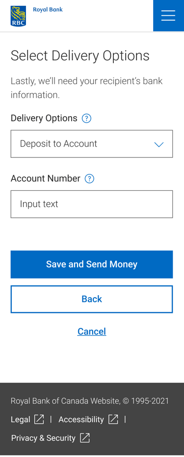
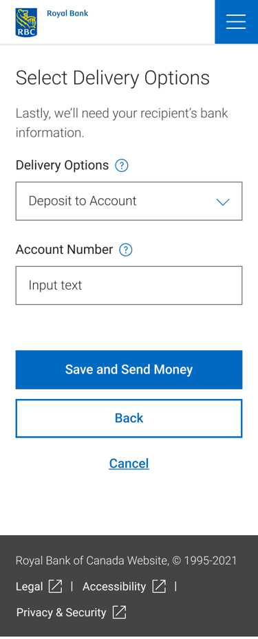
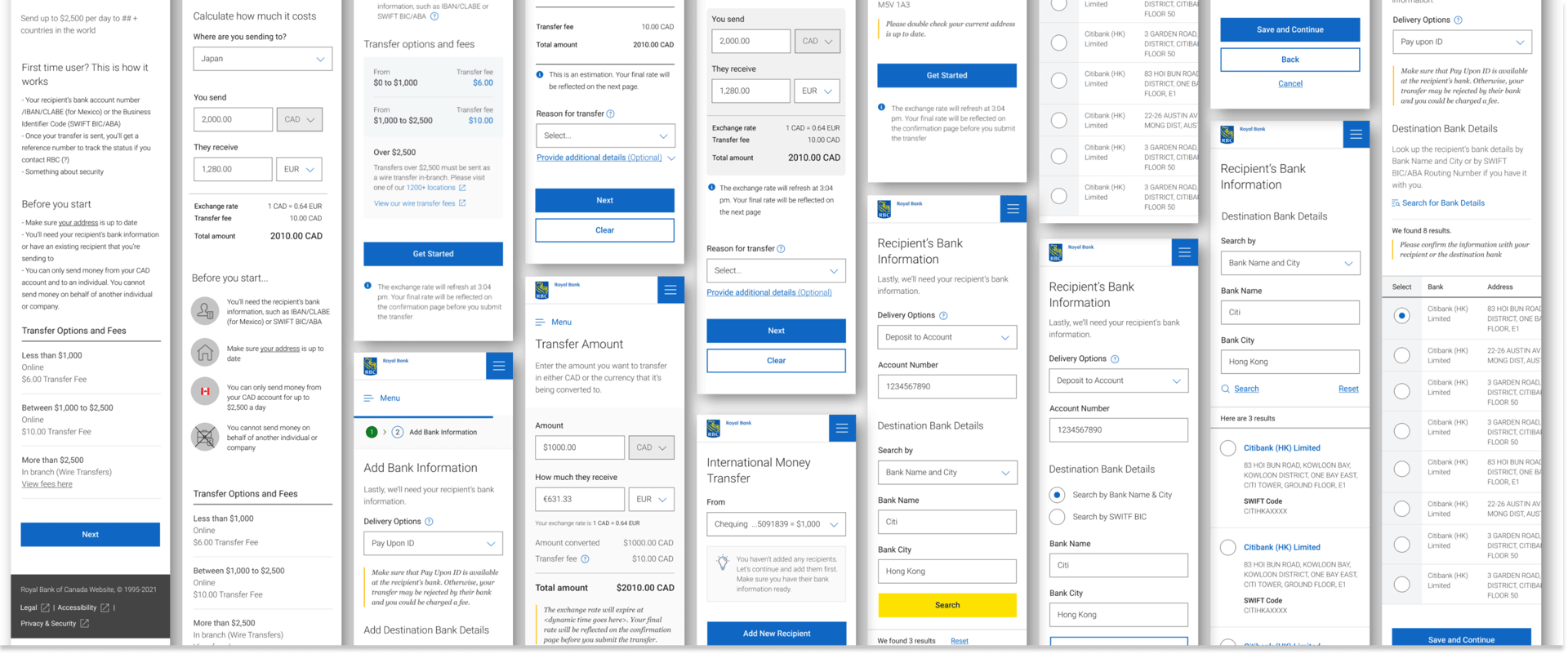
Phew! New design tested well, and we're ready for hand-off 💪🏻 Here is the final solution
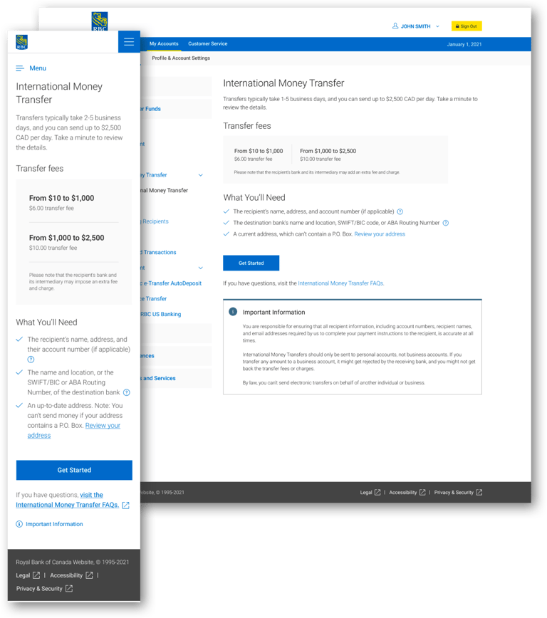
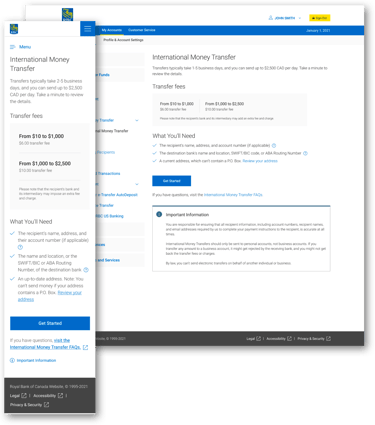
Landing Page Improvement:
Improved fee transparency
Setting expectations upfront with information that a sender would need and what to expect
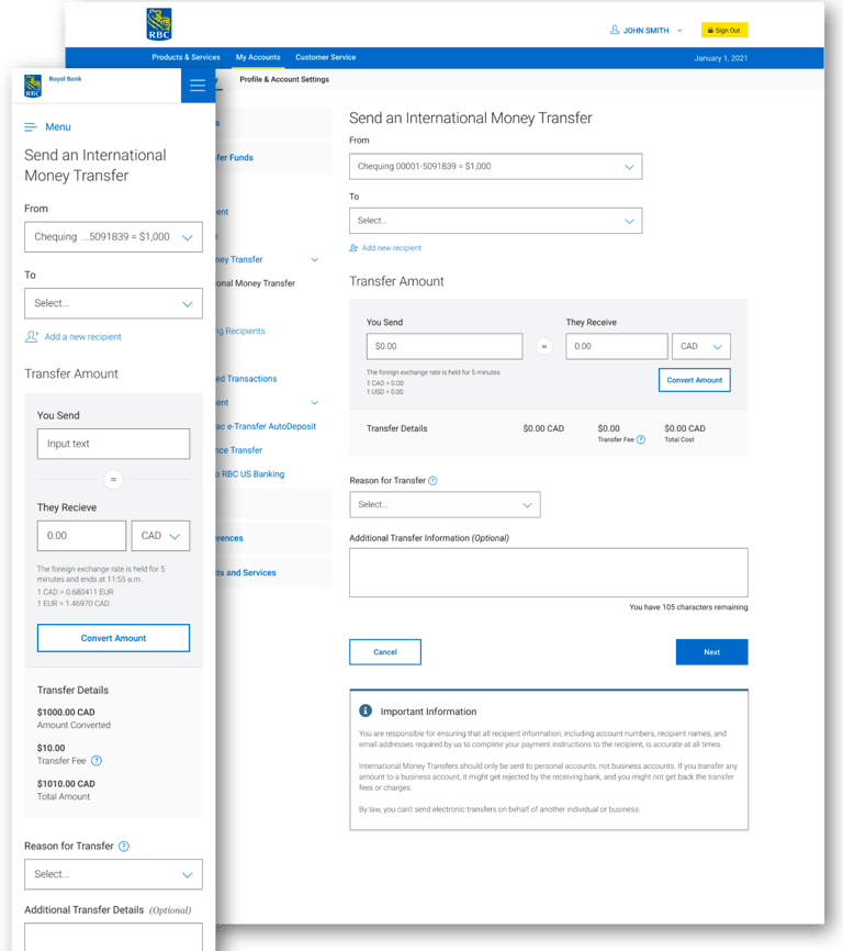

Transfer Details Improvement:
Improved converted amount with real-time conversion
Clearer conversion calculator with total fees all added up

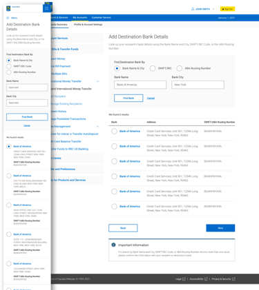
Add Destination Bank (Part of the Add Recipient flow) Improvement:
Reduce client's mental load by breaking up the Add Recipient flow into multiple pages:
Add Recipient Detail
Add Destination Bank Details
Delivery Options
Other opportunity areas
There were other opportunity areas that we wanted to explore but couldn’t due to project constraints:
Transfer status: Provide transparency of the transfer status
Improve product competitiveness: Through competitive research and client research, RBC would have to potentially lower cost, increase transfer limit, and/or improve transfer speed to compete with other providers such as PayPal, Remitly, etc.


