Significant reduction in onboarding time
RBC Wealth Management
Role: Senior UX Designer
Duration: 6 months
You're an existing RBC Retail Banking Client. You've accumulated a respectable amount of net worth and decided to move your assets to RBC Wealth Management (WM) because you need their expertise in managing your assets and investments.
During onboarding, your WM advisor treats you like a new RBC Client, asking you for your home address, phone number, SIN, etc. In addition, there is a lot of paperwork and information being passed back and forth between yourself and your advisor just to gather some basic information about you.
This data collection part of onboarding goes for 1-2 days.
Imagine this...
Puzzled.
You ask, why can't they just get the information from your RBC profile? Why does this feel so inefficient and redundant?
It doesn't feel like a one RBC experience.
How would you feel?
Frustrated.
They could've been spending time on more value-added activities, such as reviewing your investment strategy with you or discussing your goals and plans.
But here they are, doing data collection and entry work.
How would your advisor feel?
"I thought you'd already have the information from my (RBC online) profile. Why are you asking me again?"
— Client Feedback, 2021
Existing Clients are treated like new clients
RBC Personal Banking clients joining RBC Wealth Management are frustrated with the constant back and forth of information exchange during the onboarding journey.
Repetitive, non-value-added tasks for Advisors
Advisor team spends time collecting and rekeying Client’s personal information, sometimes into multiple systems. This inefficient use of the Advisor’s time can also lead to potential entry errors.
What research tells us
Clear problem space, unclear requirements
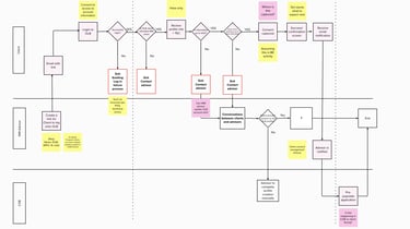
There was time pressure to begin Sprint 0, so my team's Business Analyst and I took the initiative on scoping work. We mapped out potential experiences for our clients and advisors. We also included technical notes to help our development partners get the clearest picture.
Reviewing with our stakeholders and partners, we all aligned on a shared understanding of what both experiences could look like. It was decided that one squad would be client-facing and one would be advisor-facing.
This process map then became the foundation of a story-mapping session where we outlined the MVP for the products and set a path forward for the rest of the project.
1.
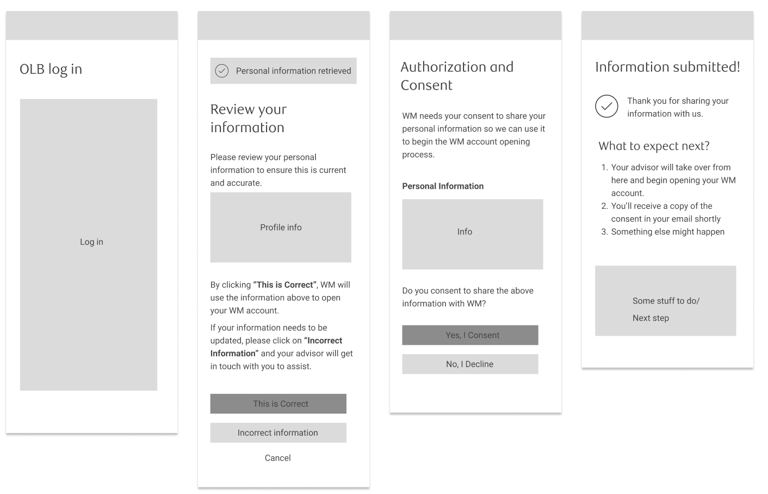
Log in to their Online Banking Account (OLB)
To initiate data sharing from retail to WM as part of their onboarding process
2.
Review personal information
Ensuring that the data being passed to WM is accurate in case Client hasn't updated their information
3.
Provide consent to sharing
Instead of signing a letter of authorization, Client can provide their digital consent to allow transfers of personal data to WM
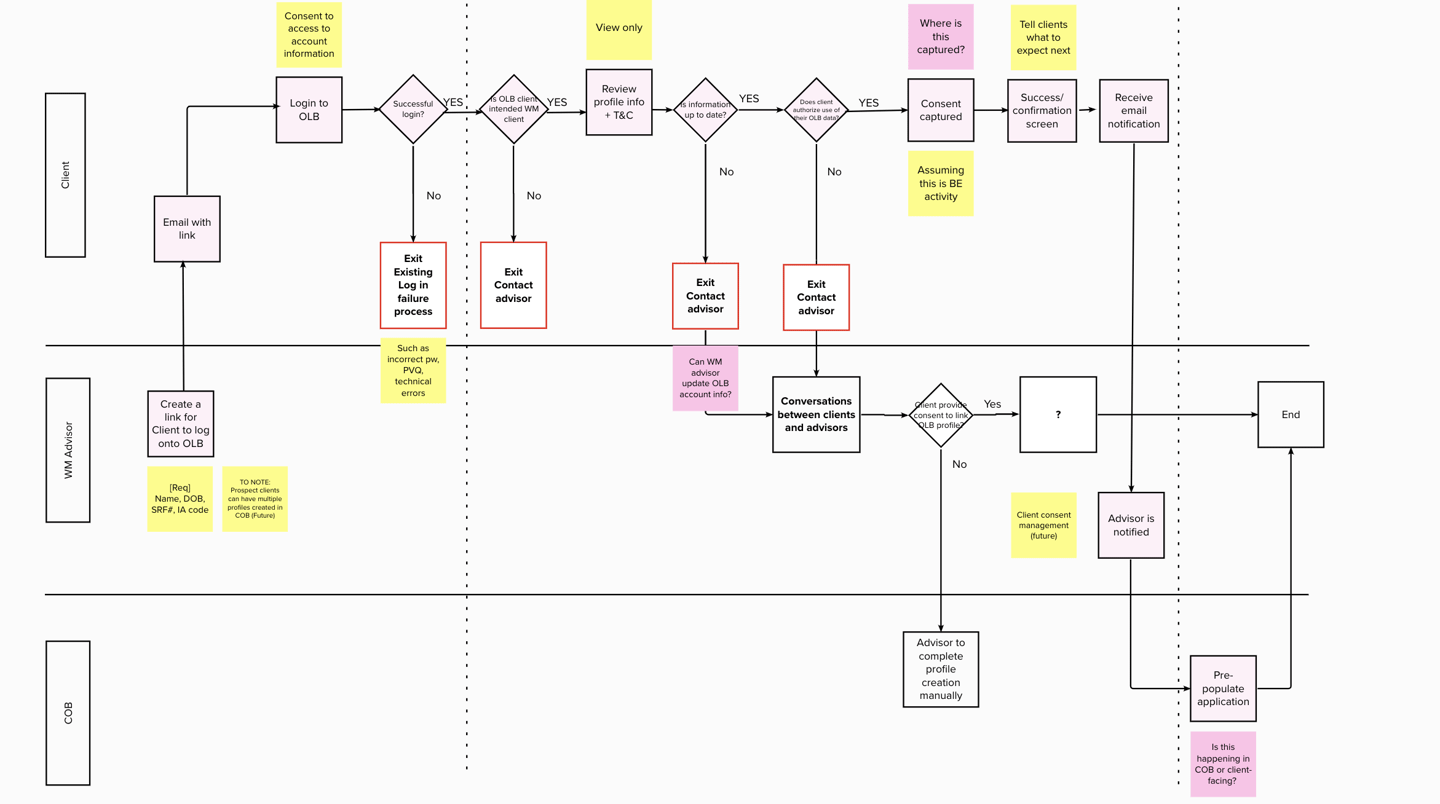
Clients must complete these three steps
While advisors must be able to:
1.
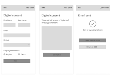
Send a private, secure link to Clients
To initiate data sharing from retail to WM as part of their onboarding process
2.
Have data automatically entered
Once information is received, client's profile is pre-populated with the most up-to-date information
Advisor to initiate "digital consent" invitation
Client to log in, review, and authorize information sharing
Ensuring the two squads are aligned
I explored how customer data could move between both applications and because there was a squad for each side of the experience, I connected with the dev leads on both squads and shared my exploration. This helped get even more alignment and created more ideas together!

We're on the right track, but our Advisors want more
Through testing, we learned that our MVP was not enough to make this a valuable tool for advisors. It's missing a few crucial pieces that would really make their workflow more efficient.
"I won't use it if it's just address and contact. It's easier to get them from the client directly rather than going through this process. I already know the client's name and contact. This process seems redundant."
— Advisor Feedback from Usability Testing, 2021
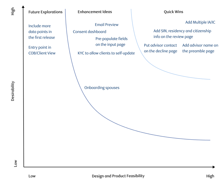
But we need to avoid scope creep
After discussing what we learned in our research, we needed to determine what’s important for our advisors in-product. I led a prioritization session with Product stakeholders to iron out these details and decide which features are must-haves and nice-to-haves based on desirability and feasibility. This helps us create a backlog of enhancement items to work on after pilot.
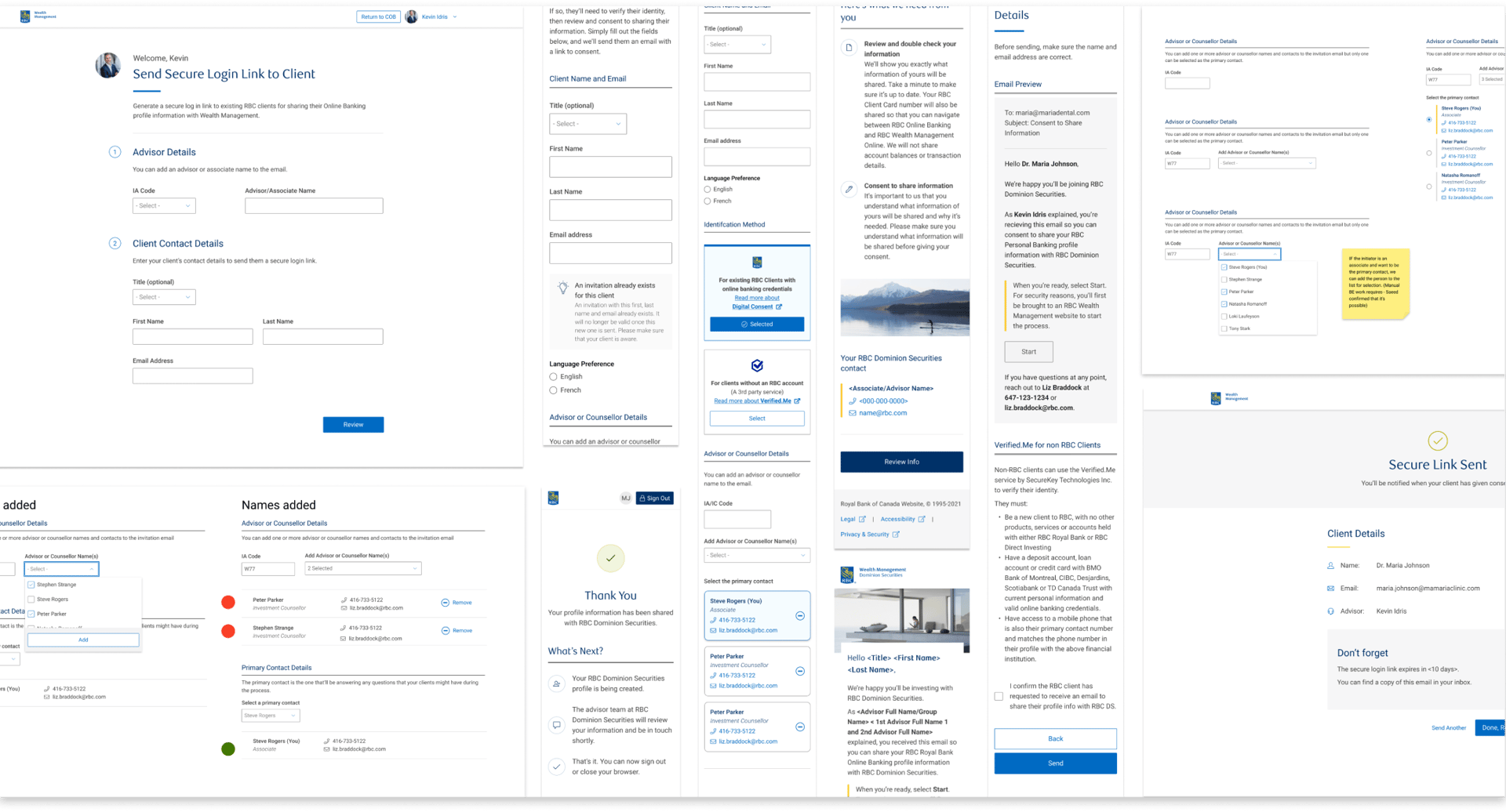
Here is the final solution
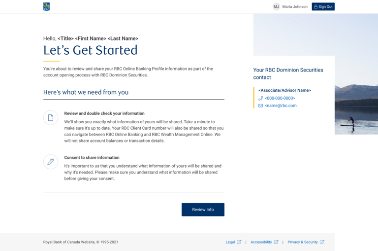
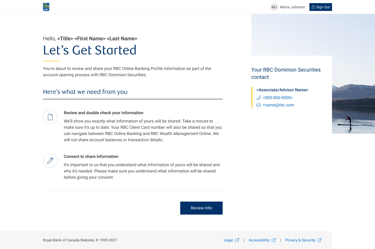
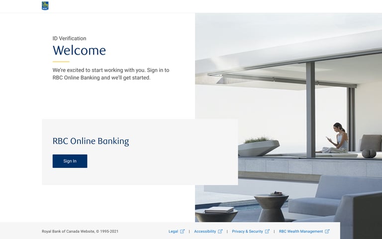
Preamble page to set expectations
Laid out what Clients can expect to do as they begin the onboarding process
Advisor contact information so they never feel like they're alone in the digital journey (white gloves service)

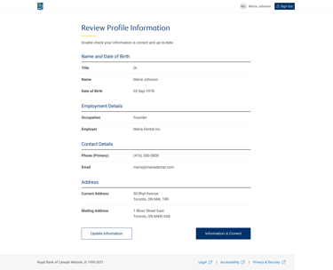
Review page to confirm profile information
Since the Client's retail banking information may be outdated, this allows a chance for the Client to review and edit before proceeding

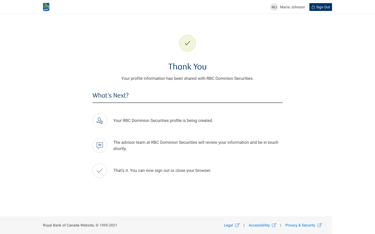
Confirmation page to close the loop
Letting the clients know what they can expect next
Ability to sign out for extra security
Other opportunity areas
For an even higher adoption rate, the advisor experience could benefit from the following:
Additional data fields such as marital status, and SIN to avoid re-engaging with clients multiple times
Dashboard to keep track of the consent provided by clients
Embedding email preview that allows advisors to customize and preview forms before sharing them with clients
Launched in 2022🥳
5 min
Average data collection time reduced from 1-2 days
89%
Completion rate
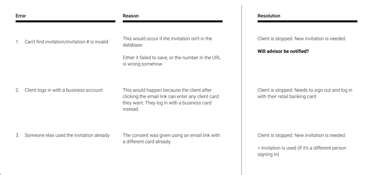
On a side note, did I already mention I love documentation?
At one point, the development team had just finished a spike to investigate potential errors and reasons. Unfortunately, there had been many back-and-forth discussions among the team that weren't documented, leading to repeated conversations (and frustration).
Since I love documentation, I thought I would just lead them through this AND make sure decisions are documented this time. As a bonus, we even worked through scenarios where a notification to the advisor was needed.